The Subtle Magic of Landscape Format Books
/We love all the books we publish here at FriesenPress, but if you ask our team, children’s books tend to hold an extra special place in our hearts.
Why? Well, so many of us fell in love with reading at a young age. There are few experiences more engrossing than being swept away by a great story – and that’s especially true when you’re a little person gripping a BIG book.
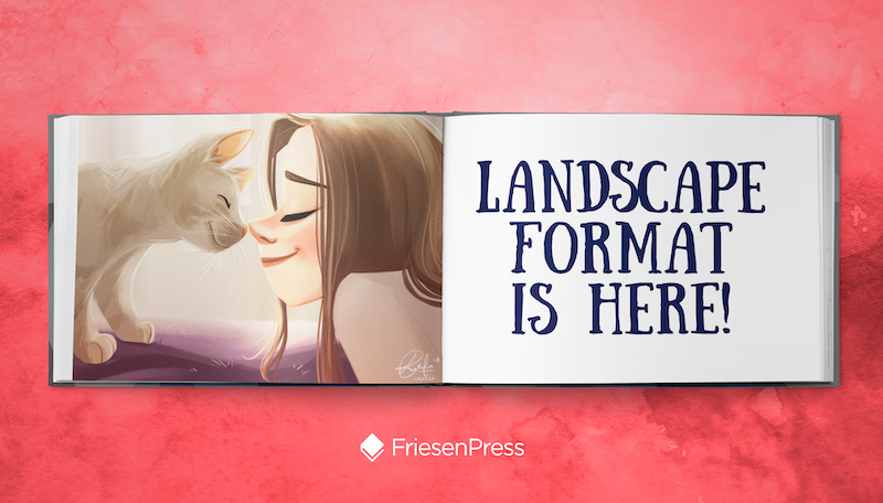
A children’s book can truly feel magical. That delight and magic is driven by fantastic characters, story, and illustrations, certainly. But one of the secrets behind children’s books’ power is landscape format. Landscape format books, most simply, are more wide than they are tall – Maurice Sendak’s Where the Wild Things Are is a classic example.
FriesenPress is one of the first publishing service providers to offer landscape format for all print-on-demand titles – but when’s it the right time to choose a landscape trim size? And what’s in it for you (and your readers)?
Author, illustrator, and FriesenPress Publishing Specialist Astra Crompton explains 3 key benefits that apply to children’s books, art books, and photobooks:
A unique reading experience
Landscape books are most comfortable being supported while read – think spread out on a coffee table, open on one’s lap, or held before an adult reader and child. It provides an outer “edge” that can be gripped while the eye focuses on key information or images that are more central on each page. It allows the eye to flow across the increased lateral space, creating a dynamic sense of movement or transition – almost like reading in widescreen.
Full, crop-free images
Portrait orientation – the “traditional” layout option – often forces authors with high quality landscape images to make some hard decisions. To fit portrait dimensions, landscape images need to be cropped or (at very least) compromised in some way.
Naturally, landscape format is designed for landscape images, meaning less (or no) cropping is required to fit the book’s available space.
If you want a full bleed (right-to-the-edge) layout, the proportions of your content need to match your book’s trim size. This also applies to text. If you have a lot of content to fit on a smaller number of pages, presenting it in two or three columns can make it look less daunting.
For children’s picture books, landscape gives you more lateral space to keep couplets or single lines from taking up too much page space. Instead, you can have the text run unobtrusively below each image.
A good rule is to always think of your trim size as a mode of presentation. What format will best show off your work?
Framing and flow
Because the eye tends to linger longer on a landscape page, you can use the natural flow of space to separate images or concepts and use time to your advantage. You can use “spot” images (smaller inset images), or enhance your layout with playfully designed text to create movement, suspense, or surprise. Excellent examples of this are the aforementioned Where the Wild Things Are, Phoebe Gilman’s Jillian Jiggs series, and Jumanji by Chris Van Allsburg.
It’s worth noting that there are times when landscape format may not be the best option for you. Specifically, landscape books won’t fit flush on a standard bookshelf. Since so many children’s books, photo books, and art books use this format, there may be a section of the bookstore that is built to accommodate landscape books. Just note that if you’re publishing a poetry book, cookbook, or technical manual, it may be harder to place it on physical shelves—though, if you are primarily selling in person or online, this may not be an issue.
If you’re not sure which format to go with, you can never go wrong by researching similar books in your genre that you admire. What did they choose? How did they use their page space effectively?
FriesenPress is one of the first publishing service providers to offer landscape format for all print-on-demand titles – give us a call at 1-800-792-5092 to see if landscape is a good fit for your project.


